COMEX Silver Deliveries
A seven-year ledger of registered drawdowns, pre-FND aggression, and the price action that did — or, more often, did not — accompany them.
The question is older than COMEX and at least as old as the futures complex itself: when the physical metal moves, does the price move with it? The conventional answer is yes — heavy demand at the delivery window represents the moment when the paper market is forced to settle in something other than itself, and a tightening physical float should, in theory, transmit upward into spot. The empirical answer is more interesting. After classifying every trading day from 28 December 2018 through 30 April 2026 into its corresponding COMEX silver delivery month, computing the size of the pre-FND issuance and the full-month registered drawdown, and overlaying spot price action across each window — the relationship is real, but it is conditional, asymmetric, and most informative precisely where it breaks.
What follows is a short tour of the dataset, the methodology used to assemble it, and the two analytical cuts that the file packages into its summary tabs. The workbook itself is downloadable at the bottom; readers are encouraged to extend it, dispute it, or repurpose its parsing layer for their own questions.
The Dataset
Eight Bloomberg series, pulled daily, parsed and stitched together against a common date axis. Five describe the COMEX silver complex directly; three triangulate it against the broader silver market — Shanghai, the spot reference, and the front-month future.
The split between registered and eligible is the load-bearing distinction. Registered metal is the inventory under warrant — actually pledged against open contracts and immediately deliverable. Eligible metal is in the same vaults, meets COMEX specifications, and could be brought to warrant — but at the moment it isn't. The two numbers are separated by little more than a paperwork act and the will of their owner. It is precisely that paperwork act, performed at scale and at speed, that the file is built to detect.
Parsing the Tape
Raw delivery-notice data is not naturally aligned to delivery months — it is aligned to trading days, and the boundary between two delivery cycles can fall anywhere inside the last week of a calendar month. The model in this workbook resolves the boundary statistically. Each day's notice count is checked against a ten-day forward-looking window; if the day sits within three calendar days of month-end and its notice count exceeds three standard deviations above the local mean, it is reclassified as belonging to the next delivery month. Everything else inherits its label from the row below by recursive fallback, anchored ultimately on the calendar first.
This matters because pre-FND issuance — the day before First Notice Day, when contract holders that intend to stand for delivery announce themselves with a wave of notices — is the most informative single observation about a given delivery month, and it occurs in the prior calendar month. A naïve calendar grouping would assign that issuance to the wrong window. The z-score logic catches it. As a recent illustration, the workbook flags 29 April 2026 — with 4,580 notices — as belonging to the May delivery cycle, not April's.
From the classified daily tape the model derives, per delivery month, the total notices issued, the FND-day notices in particular, the average registered float during the delivery window, and the spot price change from the start of the window to its end. From those primitives it constructs two ratios.
FND Deliveries / Prior-Month Average Registered
The fraction of the previous month's registered float that is being claimed in a single day's pre-FND notice. This is the aggression signal: it captures intent at the moment a delivery cycle begins, before the float has had a chance to refill via warrant migrations from the eligible pile. High readings suggest the standing demand is large relative to what is currently warranted to satisfy it.
Total Deliveries in Month / Delivery-Month Average Registered
The fraction of the registered float that the entire month's notice flow represents. This is the conversion signal: it incorporates the full delivery cycle and the float's response to it, including any warrant migrations pulled from eligible to meet the demand. High readings suggest the stack actually moved — not just that someone announced intent.
The first ratio is what FND Analysis sorts by; the second is what Total Delivery Analysis sorts by. They rank the same eighty-eight months differently, and the disagreements are where the analysis lives.
Exhibit I — FND Aggression
Sorted descending by the FND-deliveries-to-prior-month-registered ratio, the top twenty months span the entire dataset. The headliner is July 2020 at sixty-six percent — a reading more than twenty points clear of the second-place month and very nearly an outlier in its own right. The setting was the Reddit-era physical squeeze attempt, and silver did, in fact, follow: the spot price closed the delivery window thirty-seven percent above where it began. Below that line the data thickens: months at thirty to fifty percent appear in roughly equal numbers green and red, with a respectable number of single-digit-magnitude price changes in either direction.
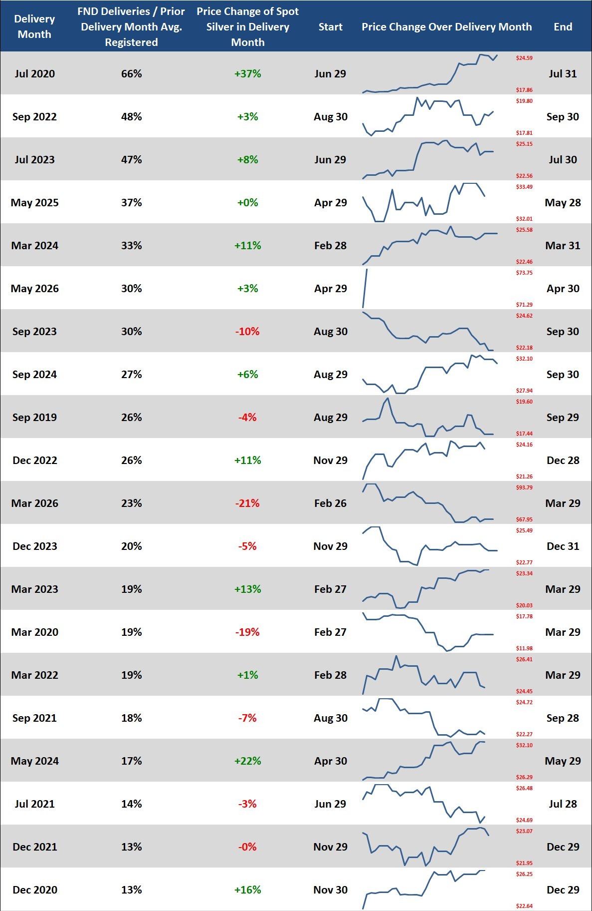
The signal here is real but soft. The base rate of positive months in the dataset is somewhere near sixty percent; the top-twenty FND-aggression months close positive at roughly the same rate. What FND aggression appears to predict is not the direction of the month but its size — the top of the table is dominated by months with double-digit moves in absolute terms, irrespective of sign. Pre-FND wave-of-notices activity is a volatility marker more than a directional one.
Exhibit II — Conversion
The second cut sorts by total deliveries in the month divided by that month's average registered float. This is the cleaner signal of the two, because it incorporates whatever response the float made to the demand — the warrant migrations, the issues-and-stops, the secondary issuance days — rather than betting everything on the opening salvo.
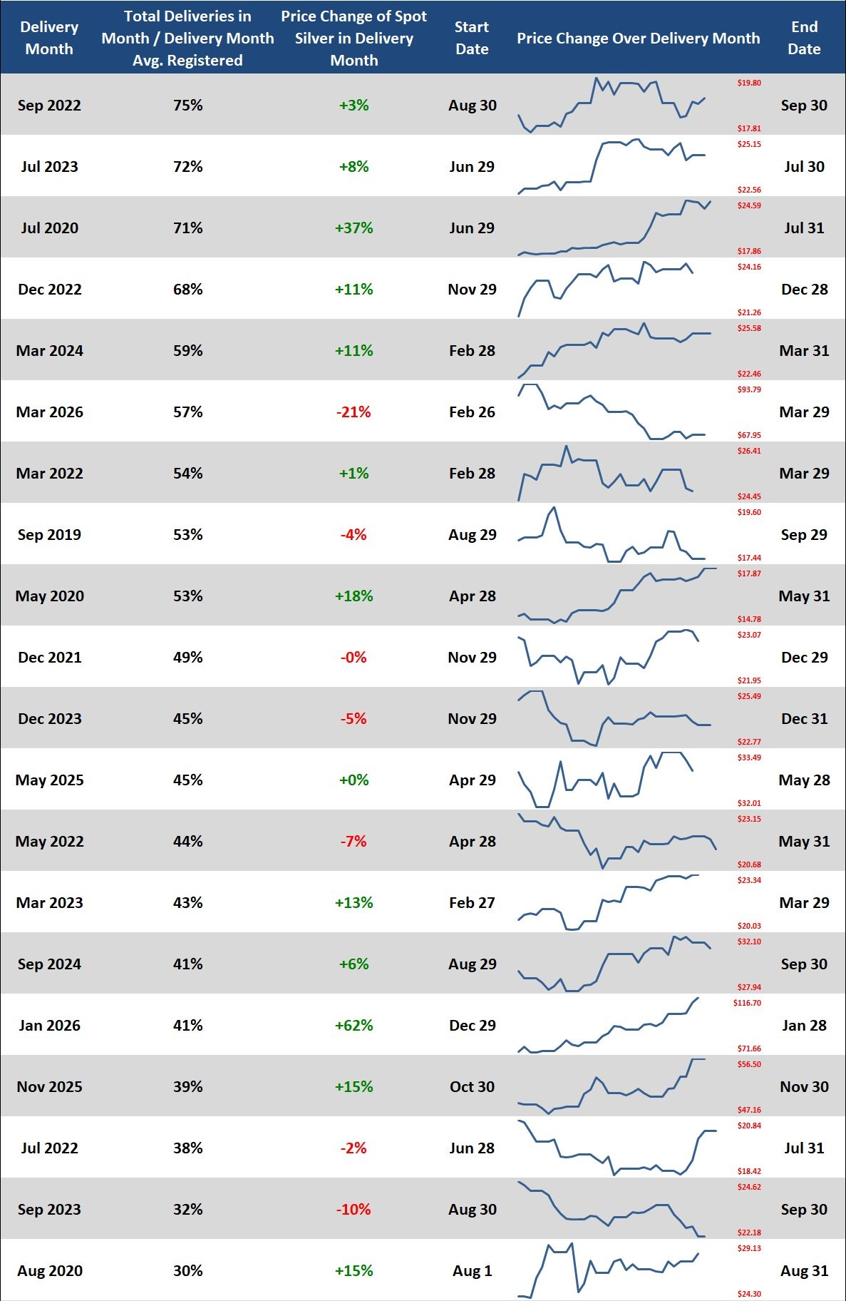
The conversion signal is directionally tighter than the aggression signal. Of the top ten by total-delivery ratio, eight closed positive on spot, one was approximately flat, and one — March 2026 — closed sharply negative. The implication is that when standing-for-delivery demand fully expresses itself across an entire cycle, dragging warrants from eligible into registered to meet it, the price tape tends to rally or hold. When the demand only announces itself loudly at the front of the cycle and then dissipates, the price tape does whatever it was already going to do.
What This Tells Us
Three observations stand out. None of them is a trade. Each of them is a piece of microstructure worth holding in mind.
-
The relationship is conditional, not linear
Across eighty-eight months, the simple regression of spot price change on either delivery-intensity ratio explains very little of the variance in monthly returns. The relationship is not a slope; it is a tail. Months in the top decile of either ratio cluster more often around large absolute moves than around average ones, but the sign of those moves is not reliably predictable from the ratio alone. The signal is in the volatility, not in the direction.
-
The disagreements between the two cuts are the interesting part
Months that print high on FND aggression but only middling on total-month conversion — a pattern of front-loaded notices that the rest of the cycle did not corroborate — read very differently from months where the two ratios both ran hot. The first pattern looks a great deal like positioning theatre: large notices announced for effect, with the registered float refilling fast enough through warrant migration that the cycle never tightened. The second pattern looks like an actual stack-pull. Reading the two tabs side-by-side is what surfaces this distinction; either one alone obscures it.
-
March 2026 is the dataset's most informative single month
Fifty-seven percent of the registered float moved during the March 2026 delivery cycle — a top-ten reading by conversion intensity — while spot silver closed the same window down twenty-one percent. Every other top-ten conversion month in the dataset closed flat or higher. The divergence is not subtle. Heavy physical pull coexisted with collapsing paper, which is the precise pattern one would expect if the paper price was being driven by something orthogonal to physical demand — margin liquidations, leverage unwinds, exogenous risk-off — while the standing-for-delivery population calmly continued to claim metal at scale through the chaos. The March 2026 cycle is where the paper-versus-physical thesis stops being a slogan and acquires a data point.
The cycle worth watching is the live one. Thirty percent on the FND ratio for May 2026 is firmly in the upper quartile of the historical record. Whether it converts into a top-ten total-month reading, and which way the spot tape closes if it does, is the open question through the end of the cycle.
Closing
The workbook is shared so that readers can extend it past the date this snapshot was taken, repoint it at gold or copper or any of the other COMEX complexes that share the registered-eligible structure, modify the parsing thresholds to suit a different definition of pre-FND, or discard the methodology entirely and use the cleaned daily tape as a starting point for something better. The two analytical tabs are framings, not conclusions. The conclusions, if there are any to be had, will come from the next eighty-eight months.
Silver Pulls — Complete Workbook
Three tabs: the parsed daily tape with derived per-month aggregates, the FND Analysis ranking, and the Total Delivery Analysis ranking. Bloomberg-fed live; reproducible parsing layer in the Data & Parsing tab. Microsoft 365 / Excel 2021+ recommended (uses dynamic array functions: FILTER, SORTBY, XLOOKUP).